

SCALE & COMPLEXITY
3 legacy portals for Corporate, Intermediary, Provider persona consolidated under one role-adaptive system
3
Shift offline→digital checkout buyers
3
Cross-sell upsell conversion increase
2
Backend systems
GIL + SWAN constraints
1
App store rating target
CONTEXT
The challenge
Bupa's three separate portals - CW for corporate clients, IW for intermediaries, PW for providers - had divergent flows, no shared design language, and were constrained by GIL and SWAN legacy backend systems throughout.
My contribution
I contributed across product strategy and UX— from market research, KPI definition, andpersona development through journey mapping,UX enhancement strategy, and high-fidelitymobile screen design. Part of the front-endand mobile design lead at Tremend · Publicis.
PROBLEM STATEMENT
Fragmented UX - no shared language
• Commission data outdated and unreliable
• No claims visibility or status tracking
• Manual workarounds replacing features
• No Excel export - PDF only
• User admin incomplete - no delete
Technical constraints
I contributed across product strategy and UX— from market research, KPI definition, andpersona development through journey mapping,UX enhancement strategy, and high-fidelitymobile screen design. Part of the front-endand mobile design lead at Tremend · Publicis.
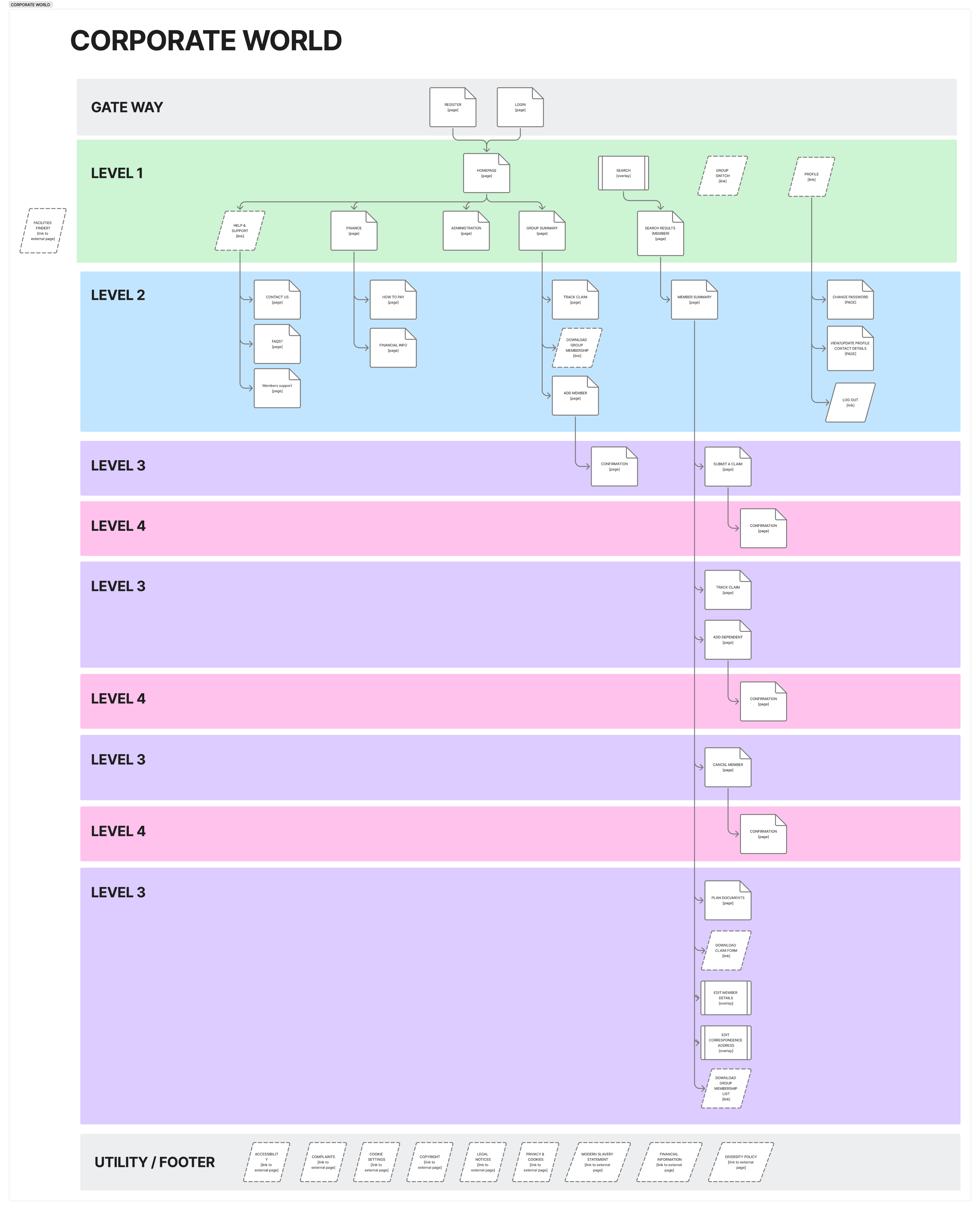
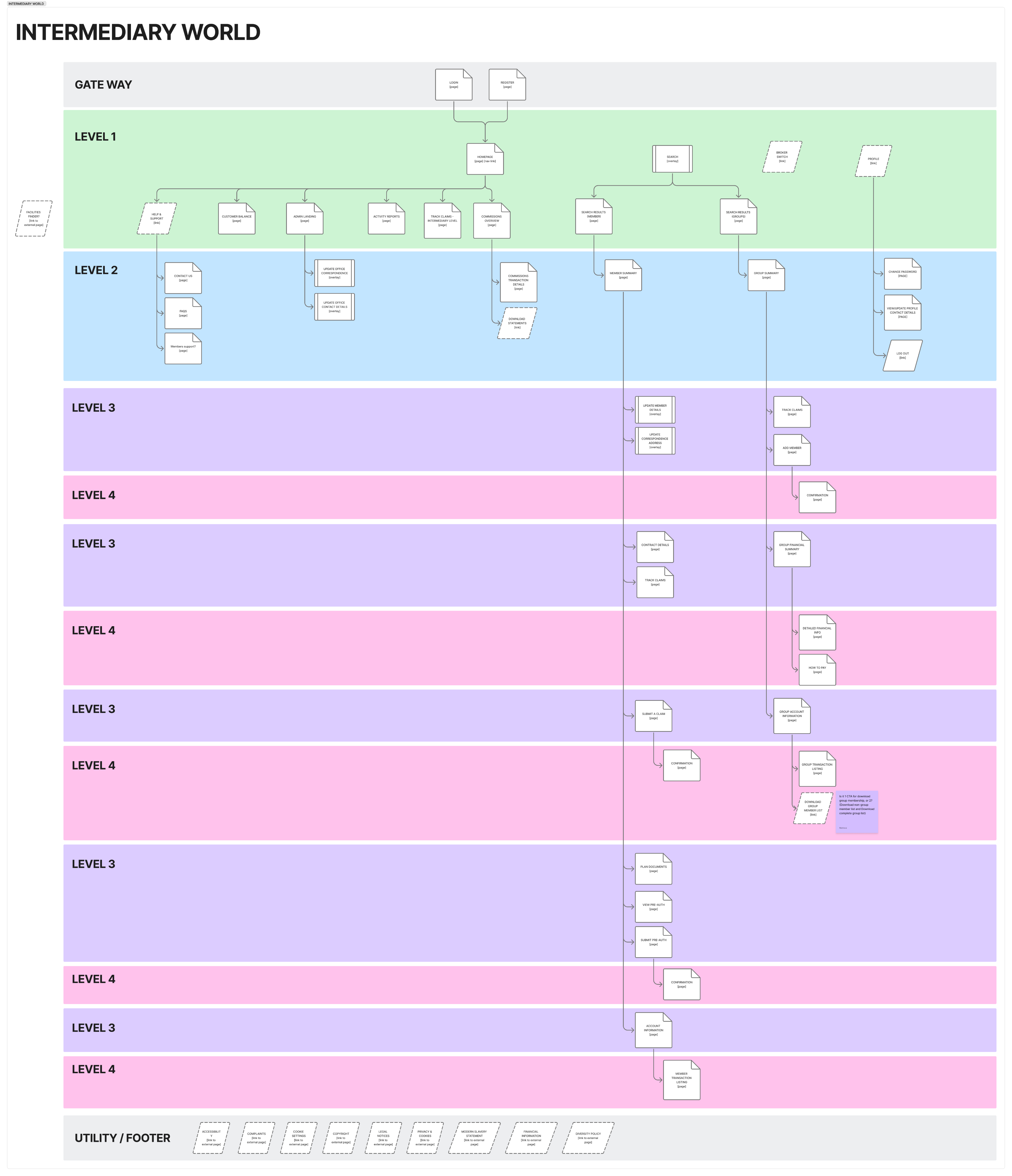
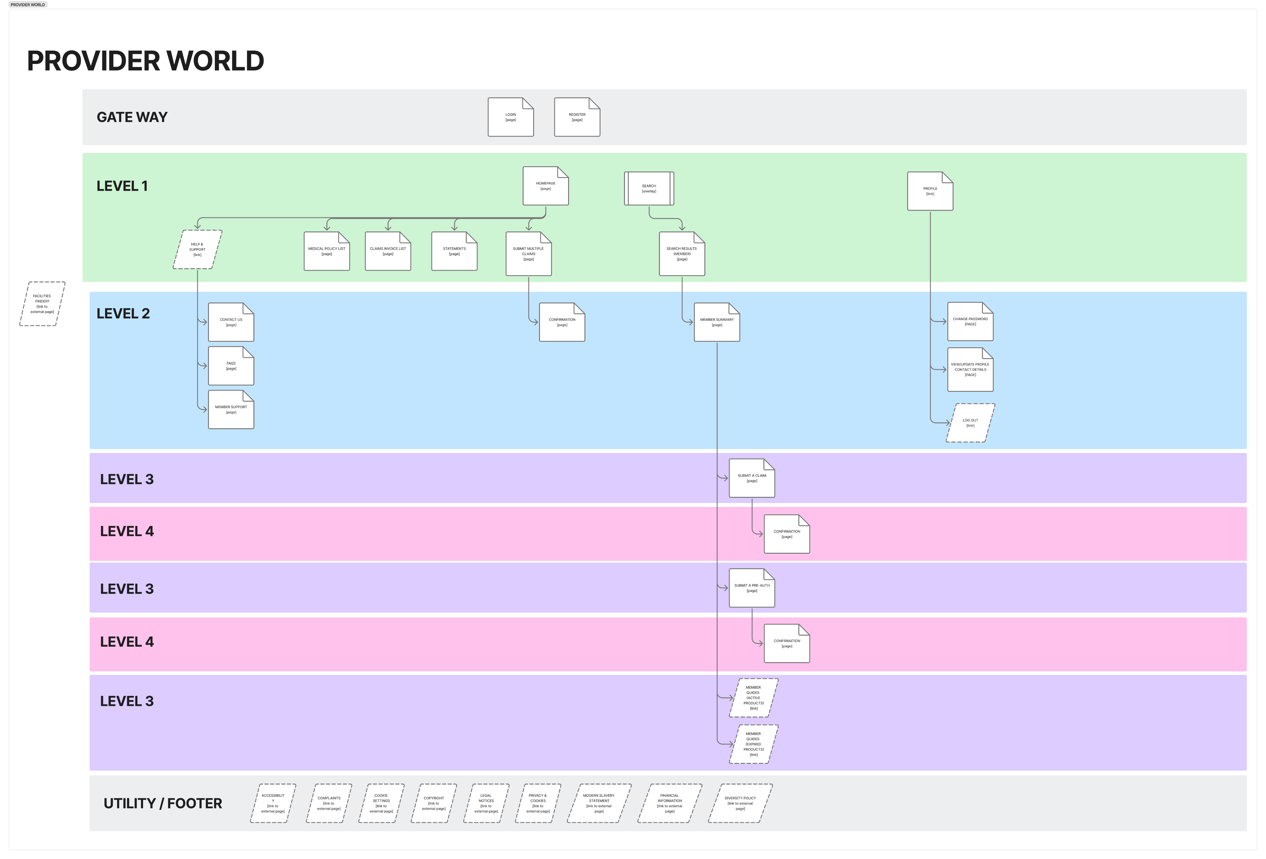
INFORMATION ARCHITECTURE - 3 PORTALS
CW • IW • PW - three distinct sitemaps unified under one system
Each portal had its own navigation depth, feature set, and user flow logic. The lA challenge was to define a role-adaptive structure where each user type sees only what is relevant to them — without duplicating code or creating separate builds for each portal.
CW • Corporate portal
Deepest structure — financial reporting, benefits admin, renewals, plan documentation flows
IW • Intermediary portal
Commission, quotes, claims, client balance, activity reports, user admin, documentation access
PW • Provider Web
Policy management, claims, prior authorisation, member lookup, financial reports, contract info
Artifact: Discovery workshop with stakeholder
USER RESEARCH - PERSONA SYNTHESIS
Extracted from user interview walkthroughs across 3 portal types
Common thread across all 3 personas:
All rely on the portal daily • all developed manual workarounds for missing features • all need real-time data, self-service controls, and clearer status visibility
UK-based professionals • intermediate to advanced digital literacy • daily portal use • high compliance pressure


Dr. Samira El-Hassan
Hospital Administrator • Claims Coordinator • UK
Primary portal: PW — daily • Intermediate digital literacy
Provider
MAIN TASKS
- Member eligibility search
- Submit claims + pre-auth
- Track payment statements
- Understand coverage
PAIN POINTS
- Search requires full membership no.
- No dependent member visibility
- Coverage language unclear
- File upload restrictions
- No direct insurer contact info
UX IMPROVEMENTS
- Search requires full membership no.
- No dependent member visibility
- Coverage language unclear
- File upload restrictions
- No direct insurer contact info
"I can't find a member unless I have their full membership number — any partial search fails."


Josh
Insurance Broker / Network Owner • UK • 5 years experience
Primary portal: IW — daily • Advanced digital literacy
Intermediary
MAIN TASKS
- Track commissions
- Manage claims
- View customer balance
- Track payment statements
- Download reports
PAIN POINTS
- Commission data outdated/incorrect
- Quote flow bypasses portal entirely·
- Claims suspended — no reason shown
- Can't delete users, only suspend
- PDF only — no Excel/CSV export
UX IMPROVEMENTS
- Real-time SWAN.NET commission sync
- Excel/CSV download + filters
- Claim status with reasoning
- Full user admin - delete + bulk
- Integrated quote flow in dashboard
"Commission data is wrong — brokers rely on this for financial tracking and we can't trust it."


Miriam
Insurance Broker / Secretary · UK · 5 years experience
Primary portal: CW — daily · Intermediate digital literacy
Corporate
MAIN TASKS
- Manage group plans
- Submit + track claims
- View financials + invoices
- Access support resources
PAIN POINTS
- Outdated content + broken links
- No group member management
- Claims only via Corporate World
- No clear navigation ownership
- Limited country options
UX IMPROVEMENTS
- Content refresh + remove dead links
- Group member management tools
- Cross-platform claim submission
- Finance workflow + audit drill-down
- Self-service user management
"There's no clear ownership of portal maintenance — content is outdated and links are broken."
SYNTHESIS - WHAT THE RESEARCH TOLD US
Manual workarounds
All 3 users had developed unofficial processes to
compensate for portal gaps.
→Sign of systemic UX debt requiring architectural change
Status invisibility
Claims, coverage, members —none showed current status clearly or in real time.
→ Core IA principle: status visible at every touchpoint
Self-service deficit
All 3 relied on email or phone for tasks the portal should handle independently.
→ Drove feature prioritisationfor the unified platform
DESIGN SYSTEM
Built from scratch · Aligned with Bupa Global Design System
Tokens and components are separated following enterprise best practice — tokens can be updated without touching component structure living in a sepaeate file in Figma, and components can evolve without breaking the token layer. This mirrors how the system
is consumed in code: tokens as variables, components as implementations
7 principles applied
Semantic naming
Consistent structure
Human-readable
Prioritise reusability
Scalability
Element omission rule
No hardcoded values
Tokens - Naming convension
Design tokens follow a consistent naming structure to ensure clarity, scalability, and alignment between design and development. A standardized naming approach improves maintainability and makes tokens easier to understand, reuse, and implement.
Token naming structure
Tokens follow this structure: [component]-[element]-[property]-[state/variant]
Component + Variant
-
Element
-
Property
-
State/Size/Special Case
Example:
button-primary
-
label
-
colour
-
default
Size example:
breadcrumb
-
text
-
font-size
-
sm
Button variant:
button-primary-outline
-
label
-
colour
-
default
Skipping the element:
button-primary-outline
-
background-colour
-
default
Component
alert
avatar
badge
radio
breadcrumb
button
form
button-primary-outline
input
button-primary
button-secondary
cardheader
checkbox
feedback
toast
Element
title
description
text
label
container
actions
icon
section
Property
font-size
font-weight
line-height
colour
background-colour
size
border-width
border-colour
border-radius
padding
gap
shadow-colour
shadow-spread
shadow-blur
State/Size/Special case
default
hover
pressed
active
focus
disabled
success
informative
warning
critical
inline
block
sm
md
lg
offset-x
offset-y
Old vs New
Old
bc
-
text
-
colour
-
default
Btn
-
label
-
typography
-
font-size
Btn
-
container
-
background-colour
-
primary
Input
-
container
-
background-colour
Btn
-
container
-
spacing
-
inline
-
tertiary
alert
-
container
-
padding
-
small
alert
-
container
-
padding
-
y
modal
-
container
-
spacing
-
inline
-
none
modal
-
container
-
spacing
-
inline
-
small
Btn
-
container
-
spacing
-
block
Btn
-
container
-
spacing
-
block
alert
-
actions
-
spacing
-
small
bc-small
-
text
-
typography
-
font-size
Input
-
form
-
label
-
typography
-
font-size
-
small
New
breadcrumb
-
text
-
colour
-
default
button
-
label
-
font-size
button-primary
-
background-colour
input
-
background-colour
button-tertiary
-
padding
-
inline
alert
-
padding
-
inline
alert
-
padding
-
block
modal
-
padding
-
inline-left
modal
-
padding
-
inline-right
button
-
gap
button
-
gap
alert
-
actions
-
gap
breadcrumb
-
text
-
font-size
-
sm
form
-
label
-
font-size
-
sm
Update
Always use component full name and small caps.
The element layer can be omitted when a property applies to the main component.
Component variant is part of component layer.
Padding as property for spacing between a component’s content and its container boundary.
Types:Inline = left/right
Block = top/bottom
Gap as property for spacing between elements (e.g. icon and text)
Size is at the end of the component.
extra small = xs
small = sm
medium = md
large = lg
extra large = xl
Principles/Guidelines
1. Use semantic namingTokens should describe purpose and usage, not raw values.Example: alert-background-colour-error instead of alert-red-500.
2. Follow a consistent structureUse a predictable naming pattern to keep tokens readable and easy to implement.Example: component-element-property-state/variant → button-primary-label-colour-default
3. Prioritize reusabilityCreate tokens that can be reused across multiple components to maintain consistency and reduce duplication.
4. Don’t hardcoded valuesComponents should use tokens instead of raw values
5. Design for scalabilityToken names should allow future expansion such as size variants, states, or themes.
6. Keep tokens clear and human-readableNames should be easy to understand for both designers and developers.
7. Rule for omitting the elementThe element layer can be omitted when a property applies to the main component container and there are no other elements that could share the same property.
KEY DESIGN DECISIONS
Strategic calls made under constraint — not just design execution
1
Built our own design library — rejected Bupa's 7 inconsistent files
They were inconsistent, overlapping, and unmaintainable at scale. As a design team we made the decision to build a single, structured two-file system from scratch — aligned with Bupa Global DS principles but rebuilt for consistency, scalability, and developer handoff.
Team decision
Design leadership
Token-first system
2
Redesigned key flows within GIL and SWAN constraints
Legacy backend systems (GIL and SWAN) imposed hard limits on what could be built. Rather than working around constraints at surface level, we redesigned the underlying flows — commission tracking, claims submission, user admin — to deliver modern UX within the technical boundaries, not despite them.
Flow redesign
Legacy constraints
GIL · SWAN
3
Delivered to production without complete requirements
Requirements were not finalised when design work began. Rather than blocking delivery, we started with what was known — accepting that extra iterations would follow. This decision kept the project moving and allowed development to begin while design continued to evolve. Multiple iteration rounds were built into the process from the start.
Agile delivery
Extra iterations
Production delivery
4
Multi-stage approval — internal critique → BA → SME sign-off
Design proposals went through internal team critique before reaching stakeholders. Multiple design directions were explored and debated internally — only the strongest proposals moved forward to Business Analysts and Subject Matter Experts for approval. This process ensured design decisions were evidence-based before entering stakeholder review.
Internal critique
BA approval
SME sign-off
Stakeholder management
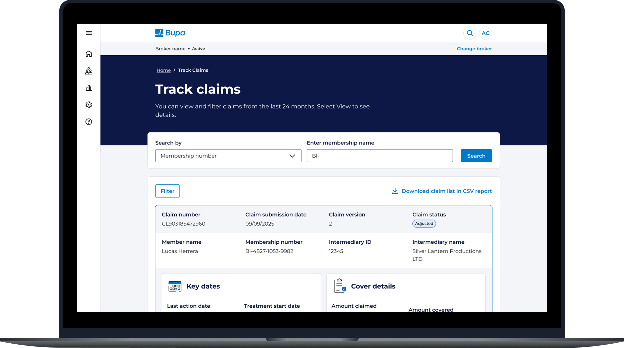
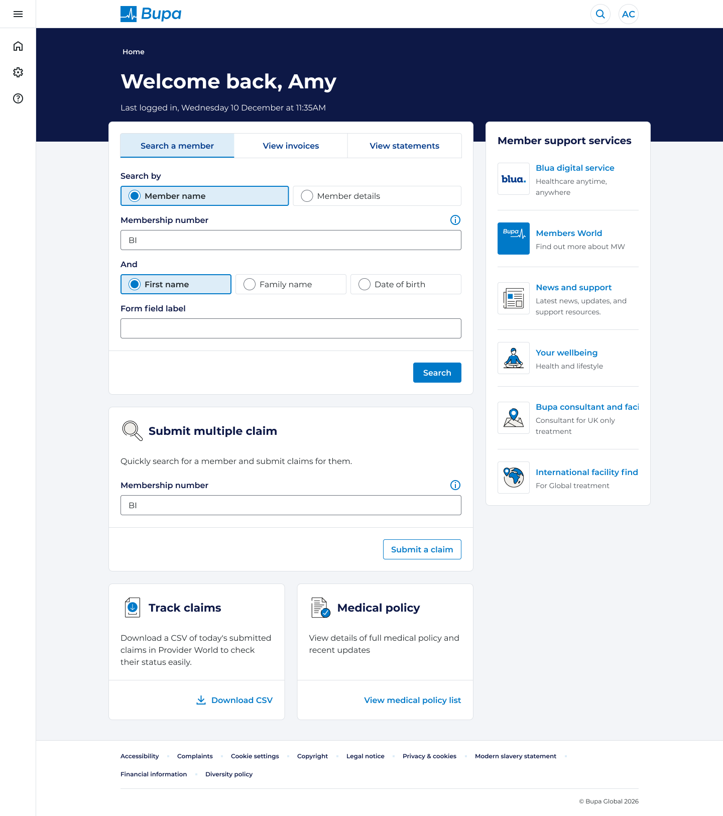
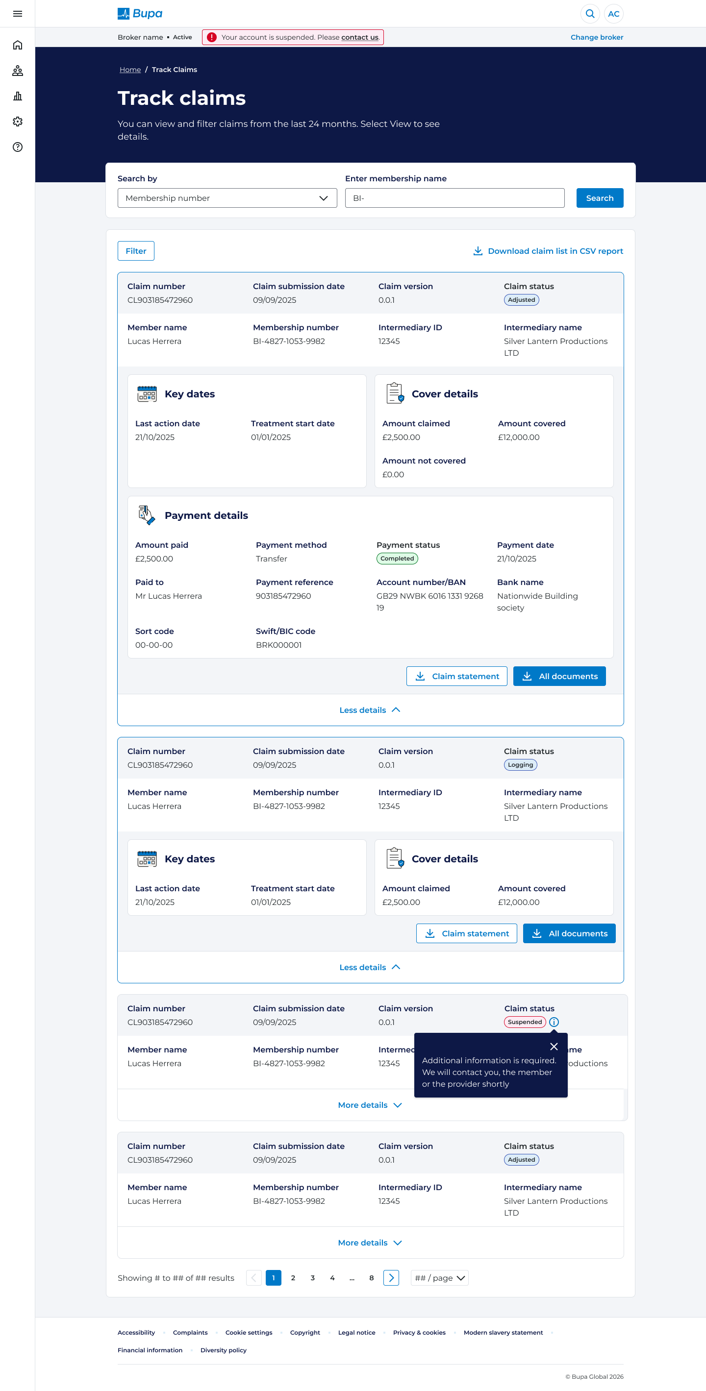
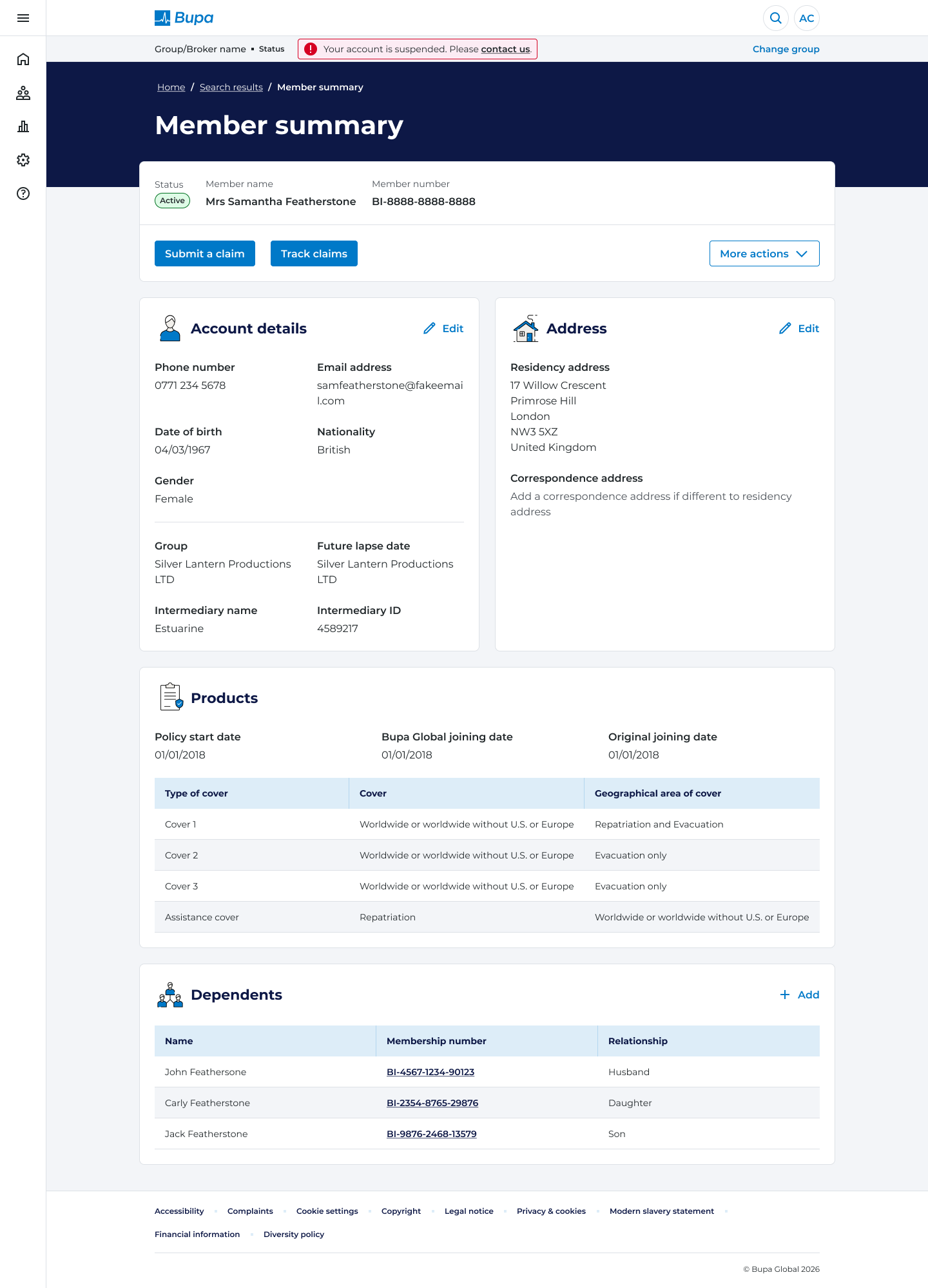
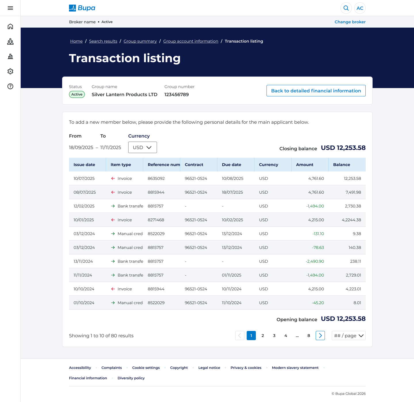
FINAL DESIGN — HIGH FIDELITY SCREENS
Desktop first, tablet and mobile responsive.
Dashboard
Track claims
Member Summary
Transaction listing
REFLECTION
What I learned
Bupa taught me that the most complex UX challenge isn't designing for users - it's designing within systems that weren't built for modern UX. Navigating GIL and SWAN sharpened my ability to advocate for design decisions with technical rationale. The user interviews revealed that manual workarounds had become standard - a sign of systemic UX debt that needed architectural change, not just Ul polish.


