RANOSEMI

Home

Case studies

About

Contact

MVP — Holistic Financial Dashboard

Product Strategy & UI Concept Design

Fintech · Banking

Competitive Analysis · Feature Prioritisation · UI Design

Android Mobile

CONTEXT

The challenge

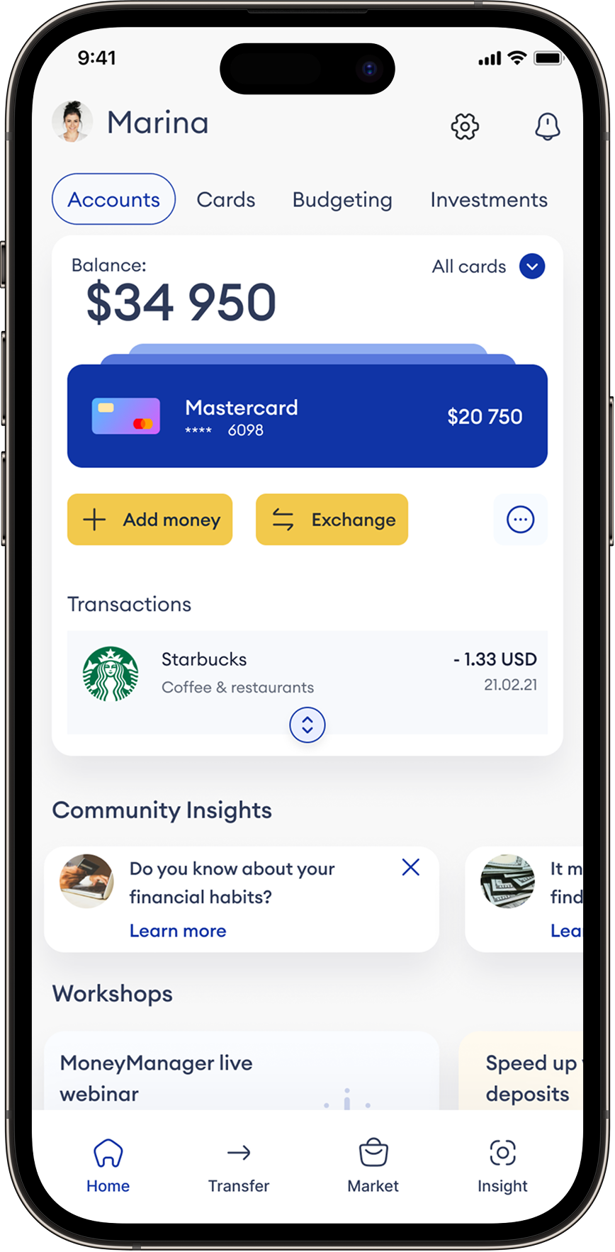
Most banking apps handle one job well — checking a balance, moving money — but fragment everything else. Investments live in one app, budgeting in another, financial education nowhere at all. FinConnect is a concept for a single Android dashboard that brings accounts, investments, budgeting, and financial literacy into one coherent view, designed around the idea that managing money shouldn't mean managing five apps.

My contribution

  • Competitive analysis across 6 major banking and payment apps
  • Feature prioritisation — narrowing a broad concept list to a defensible MVP
  • Information architecture for an 8-module dashboard
  • High-fidelity UI design for core dashboard screens

COMPETITIVE ANALISYS

Strategic research

I reviewed six market leaders spanning traditional banking and peer-to-peer payments to find the gap FinConnect could fill. The pattern: every app does one thing well and treats everything else as an afterthought.

Chase Mobile

Clear bottom-nav structure, biometric login, smooth transaction history

Login, smooth transaction history Information density overwhelms on smaller screens

Bank of America

Multi-account integration, built-in budget tracking

Occasional lag; UI feels crowded on smaller devices

Wells Fargo

Fast account management, card-free ATM access

Hard to locate specific information; sync issues with linked accounts

Capital One

Clear bottom-nav structure, biometric login, smooth transaction history

Login, smooth transaction history Information density overwhelms on smaller screens

PayPal

Clear bottom-nav structure, biometric login, smooth transaction history

Login, smooth transaction history Information density overwhelms on smaller screens

Venmo

Clear bottom-nav structure, biometric login, smooth transaction history

Login, smooth transaction history Information density overwhelms on smaller screens

The gap

No app in the set combined account management, investing, budgeting, and education in one place — and none addressed values-driven, ethical banking. That gap defined FinConnect's core concept.

CONCEPT DIRECTION

This was a concept exploration without a user research phase — the feature set below reflects strategic prioritisation against the competitive gap, not validated user need. Of an initial list of ten potential features, three were carried into the design as the strongest fit for a first release.

1

Holistic dashboard

One customisable view aggregating bank accounts, investments, and cards — the single feature no competitor offered.

2

Budgeting & insights

Category-based spending tracking with alerts and optimisation suggestions, addressing the "crowded, hard to find" complaint across competitors.

3

Financial education

Workshops and tutorials built into the dashboard itself — directly answering the literacy gap none of the six competitors addressed.

DASHBOARD WALKTHROUGH

An 8-module structure, navigable from a persistent header. Each module is independent and can be reordered by the user from settings.

Overview

At-a-glance net worth and cash flow, with interactive charts comparing income, expenses, and investment growth.

Accounts

Linked banks, cards, and instruments shown with balance and recent activity — tap into any account for full transaction history.

Budgeting

Category-based spending limits, monthly tracking, and proactive alerts as users approach a budget threshold.

Investments

Portfolio performance and allocation, with visualisations for tracking growth over time.

Community

Anonymised peer benchmarking — see how spending and saving habits compare to similar users.

Workshops

Personalised financial literacy content — live sessions, tutorials, and articles matched to user goals.

Quick actions & alerts

One-tap transfers, bill payments, and automated savings setup, plus notifications for due dates and milestones.

Marketplace

Curated third-party financial products — loans, insurance, investments — comparable and actionable in-app.

REFLECTION

What worked

The competitive analysis gave the concept a real anchor — instead of designing every feature on the original wishlist, narrowing to three meant the dashboard had a clear point of view: consolidation, clarity, and financial literacy, rather than trying to out-feature every competitor at once.

What I'd evolve

I contributed across product strategy and UX— from market research, KPI definition, andpersona development through journey mapping,UX enhancement strategy, and high-fidelitymobile screen design. Part of the front-endand mobile design lead at Tremend · Publicis.

RANOSEMI

Home

Case studies

About

Contact

MVP — Holistic Financial Dashboard

Product Strategy & UI Concept Design

Fintech · Banking

Competitive Analysis · Feature Prioritisation · UI Design

Android Mobile

CONTEXT

The challenge

Most banking apps handle one job well — checking a balance, moving money — but fragment everything else. Investments live in one app, budgeting in another, financial education nowhere at all. FinConnect is a concept for a single Android dashboard that brings accounts, investments, budgeting, and financial literacy into one coherent view, designed around the idea that managing money shouldn't mean managing five apps.

My contribution

  • Competitive analysis across 6 major banking and payment apps
  • Feature prioritisation — narrowing a broad concept list to a defensible MVP
  • Information architecture for an 8-module dashboard
  • High-fidelity UI design for core dashboard screens

COMPETITIVE ANALISYS

Strategic research

I reviewed six market leaders spanning traditional banking and peer-to-peer payments to find the gap FinConnect could fill. The pattern: every app does one thing well and treats everything else as an afterthought.

Application

Strength

Weakness

Chase Mobile

Clear bottom-nav structure, biometric login, smooth transaction history

Login, smooth transaction history Information density overwhelms on smaller screens

Bank of America

Multi-account integration, built-in budget tracking

Occasional lag; UI feels crowded on smaller devices

Wells Fargo

Fast account management, card-free ATM access

Hard to locate specific information; sync issues with linked accounts

Capital One

Clear bottom-nav structure, biometric login, smooth transaction history

Login, smooth transaction history Information density overwhelms on smaller screens

PayPal

Clear bottom-nav structure, biometric login, smooth transaction history

Login, smooth transaction history Information density overwhelms on smaller screens

Venmo

Clear bottom-nav structure, biometric login, smooth transaction history

Login, smooth transaction history Information density overwhelms on smaller screens

The gap

No app in the set combined account management, investing, budgeting, and education in one place — and none addressed values-driven, ethical banking. That gap defined FinConnect's core concept.

CONCEPT DIRECTION

This was a concept exploration without a user research phase — the feature set below reflects strategic prioritisation against the competitive gap, not validated user need. Of an initial list of ten potential features, three were carried into the design as the strongest fit for a first release.

1

Holistic dashboard

One customisable view aggregating bank accounts, investments, and cards — the single feature no competitor offered.

2

Budgeting & insights

Category-based spending tracking with alerts and optimisation suggestions, addressing the "crowded, hard to find" complaint across competitors.

3

Financial education

Workshops and tutorials built into the dashboard itself — directly answering the literacy gap none of the six competitors addressed.

DASHBOARD WALKTHROUGH

An 8-module structure, navigable from a persistent header. Each module is independent and can be reordered by the user from settings.

Overview

At-a-glance net worth and cash flow, with interactive charts comparing income, expenses, and investment growth.

Accounts

Linked banks, cards, and instruments shown with balance and recent activity — tap into any account for full transaction history.

Budgeting

Category-based spending limits, monthly tracking, and proactive alerts as users approach a budget threshold.

Investments

Portfolio performance and allocation, with visualisations for tracking growth over time.

Community

Anonymised peer benchmarking — see how spending and saving habits compare to similar users.

Workshops

Personalised financial literacy content — live sessions, tutorials, and articles matched to user goals.

Quick actions & alerts

One-tap transfers, bill payments, and automated savings setup, plus notifications for due dates and milestones.

Marketplace

Curated third-party financial products — loans, insurance, investments — comparable and actionable in-app.

REFLECTION

What worked

The competitive analysis gave the concept a real anchor — instead of designing every feature on the original wishlist, narrowing to three meant the dashboard had a clear point of view: consolidation, clarity, and financial literacy, rather than trying to out-feature every competitor at once.

What I'd evolve

I contributed across product strategy and UX— from market research, KPI definition, andpersona development through journey mapping,UX enhancement strategy, and high-fidelitymobile screen design. Part of the front-endand mobile design lead at Tremend · Publicis.

RANOSEMI

Home

Case studies

About

Contact

MVP — Holistic Financial Dashboard

Product Strategy & UI Concept Design

Fintech · Banking

Competitive Analysis · Feature Prioritisation · UI Design

Android Mobile

CONTEXT

The challenge

Most banking apps handle one job well — checking a balance, moving money — but fragment everything else. Investments live in one app, budgeting in another, financial education nowhere at all. FinConnect is a concept for a single Android dashboard that brings accounts, investments, budgeting, and financial literacy into one coherent view, designed around the idea that managing money shouldn't mean managing five apps.

My contribution

  • Competitive analysis across 6 major banking and payment apps
  • Feature prioritisation — narrowing a broad concept list to a defensible MVP
  • Information architecture for an 8-module dashboard
  • High-fidelity UI design for core dashboard screens

COMPETITIVE ANALYSIS

Strategic research

I reviewed six market leaders spanning traditional banking and peer-to-peer payments to find the gap FinConnect could fill. The pattern: every app does one thing well and treats everything else as an afterthought.

Application

Strength

Weakness

Chase Mobile

Clear bottom-nav structure, biometric login, smooth transaction history

Login, smooth transaction history Information density overwhelms on smaller screens

Bank of America

Multi-account integration, built-in budget tracking

Occasional lag; UI feels crowded on smaller devices

Wells Fargo

Fast account management, card-free ATM access

Hard to locate specific information; sync issues with linked accounts

Capital One

Clear bottom-nav structure, biometric login, smooth transaction history

Login, smooth transaction history Information density overwhelms on smaller screens

PayPal

Clear bottom-nav structure, biometric login, smooth transaction history

Login, smooth transaction history Information density overwhelms on smaller screens

Venmo

Clear bottom-nav structure, biometric login, smooth transaction history

Login, smooth transaction history Information density overwhelms on smaller screens

The gap

No app in the set combined account management, investing, budgeting, and education in one place — and none addressed values-driven, ethical banking. That gap defined FinConnect's core concept.

CONCEPT DIRECTION

This was a concept exploration without a user research phase — the feature set below reflects strategic prioritisation against the competitive gap, not validated user need. Of an initial list of ten potential features, three were carried into the design as the strongest fit for a first release.

1

Holistic dashboard

One customisable view aggregating bank accounts, investments, and cards — the single feature no competitor offered.

2

Budgeting & insights

Category-based spending tracking with alerts and optimisation suggestions, addressing the "crowded, hard to find" complaint across competitors.

3

Financial education

Workshops and tutorials built into the dashboard itself — directly answering the literacy gap none of the six competitors addressed.

DASHBOARD WALKTHROUGH

An 8-module structure, navigable from a persistent header. Each module is independent and can be reordered by the user from settings.

Overview

At-a-glance net worth and cash flow, with interactive charts comparing income, expenses, and investment growth.

Accounts

Linked banks, cards, and instruments shown with balance and recent activity — tap into any account for full transaction history.

Budgeting

Category-based spending limits, monthly tracking, and proactive alerts as users approach a budget threshold.

Investments

Portfolio performance and allocation, with visualisations for tracking growth over time.

Community

Anonymised peer benchmarking — see how spending and saving habits compare to similar users.

Workshops

Personalised financial literacy content — live sessions, tutorials, and articles matched to user goals.

Quick actions & alerts

One-tap transfers, bill payments, and automated savings setup, plus notifications for due dates and milestones.

Marketplace

Curated third-party financial products — loans, insurance, investments — comparable and actionable in-app.

REFLECTION

What worked

The competitive analysis gave the concept a real anchor — instead of designing every feature on the original wishlist, narrowing to three meant the dashboard had a clear point of view: consolidation, clarity, and financial literacy, rather than trying to out-feature every competitor at once.

What I'd evolve

This concept was built without user validation — the natural next step would be testing the dashboard's information density against real users, particularly around how many modules someone actually wants visible at once versus how many were assumed useful at the brief stage.