


IMPACT & OUTCOMES
9/10
Shift offline→digital checkout buyers
1-tap
Cross-sell upsell conversion increase
1-tap
inquiry acceptance — collapsed a multi-step flow that 24% of users failed to complete
5
App store rating target
CONTEXT
The challenge
Hostaway is a property management system (PMS) that helps vacation rental managers run multi-platform operations across Airbnb, VRBO, Booking.com, and Expedia. Property managers — often running dozens of listings — rely on the platform daily for reservations, guest communication, task assignment, and financial oversight.
The existing mobile app was not built around how managers actually work in the field. Time-critical actions required too many steps, guest information was buried, and routine tasks like accepting inquiries or creating staff tasks lacked the speed and clarity the job demands.
My contribution
I contributed across product strategy and UX— from market research, KPI definition, andpersona development through journey mapping,UX enhancement strategy, and high-fidelitymobile screen design. Part of the front-endand mobile design lead at Tremend · Publicis.
DISCOVERY
Strategic research
I combined quantitative surveys and qualitative interviews across 25 property managers to map how they actually spend their time — and where the current app was losing them. Usability tests validated both pain points and design direction, run across both fidelity levels before moving to UI.
35%
of daily time spent on guest management and administration — the most frequent and highest-stakes task category
30%
on replying to messages and approving reservations — flagged by 25% of users as time-critical
38%
said finding a guest's name and profile was the hardest task in the app
24%
struggled to accept an inquiry — a core conversion action on every reservation
Key pain points surfaced
- Guest name and profile not surfaced on reservation cards — required multiple taps to locate
- Accepting an inquiry had no clear affordance; managers missed time windows on bookings
- Payment reminder flow buried — managers resorted to desktop for this task
- Task creation for staff required navigating away from the reservation context
- No clear visual hierarchy between current and upcoming reservations
- 75% of respondents used the app as their primary work tool — not desktop-first
Research verdict
"They were frustrated because they had to stand at a desk and open a laptop every time a core task came up. The mobile app existed — it just didn't keep pace with the job."
USER RESEARCH — 6 PERSONA TYPES
One primary persona emerged clearly from research — the active, multi-property manager who operates entirely on the move. Secondary user types (staff, property owners) informed edge cases but the design was anchored to this core.
Thiago Gomez
Property Manager · Madrid
"I need to respond to guests before a competitor does — every minute a reservation sits unconfirmed is money left on the table."
Needs
Accept inquiries fast · Contact guest in one tap · Create staff tasks in context · Know guest status at a glance
Frustrations
Can't find guest profile quickly · Notifications unreliable · Payment reminder requires desktop
Lucia Gal
Staff coordinator
Operations · Field-based
"I need to know what tasks are assigned to me today without wading through the whole property list."
Needs
Clear daily task list · Task assignments with property context · Real-time updates from manager
Frustrations
Task screen mixes weekly and daily without clear separation · No context linking tasks to reservations
Alejandra Martinez
Property owner
Investor · Remote oversight
"I want to know my properties are running — without having to call anyone to find out."
Needs
Revenue snapshot · Occupancy at a glance · Guest satisfaction visibility
Frustrations
Reporting not accessible on mobile · Has to rely on manager for basic status updates
DEFINE & SOLUTION
Design principles
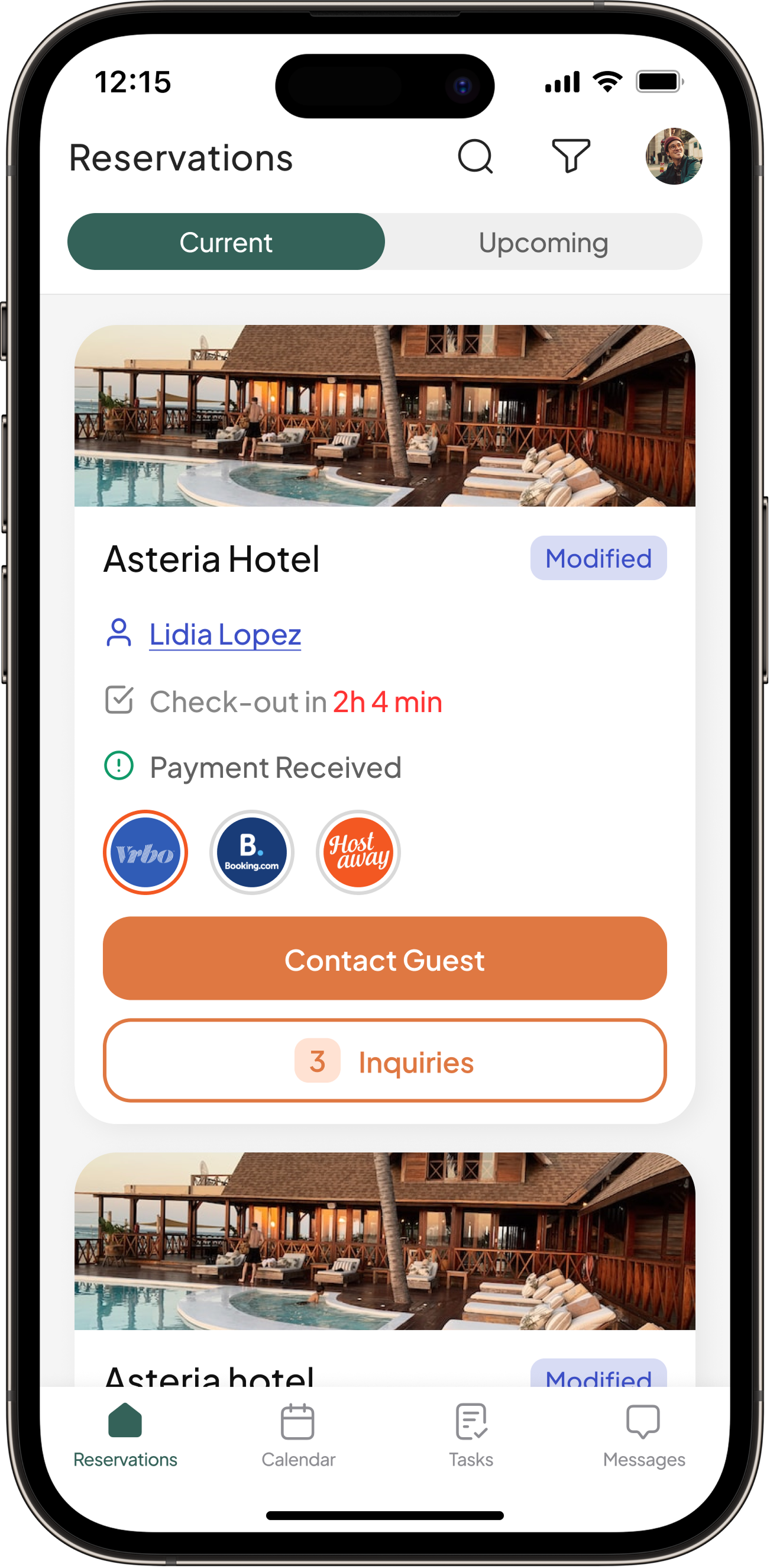
One chief action per screen. Surface the most time-critical information immediately — guest name, check-out countdown, payment status — without any tap. Every primary task must be reachable in 2 taps or fewer from the reservations list.
Solution framing
Migrate the five highest-frequency desktop tasks to a mobile-first interaction model: viewing guest profile, contacting a guest, sending a payment reminder, accepting an inquiry, and creating a staff task — all from the reservation card, without leaving context.
Key product touchpoints
Reservations
Redesigned card surfaces guest name, check-out urgency, payment status, and platform source. Contact and inquiry actions promoted to card level.
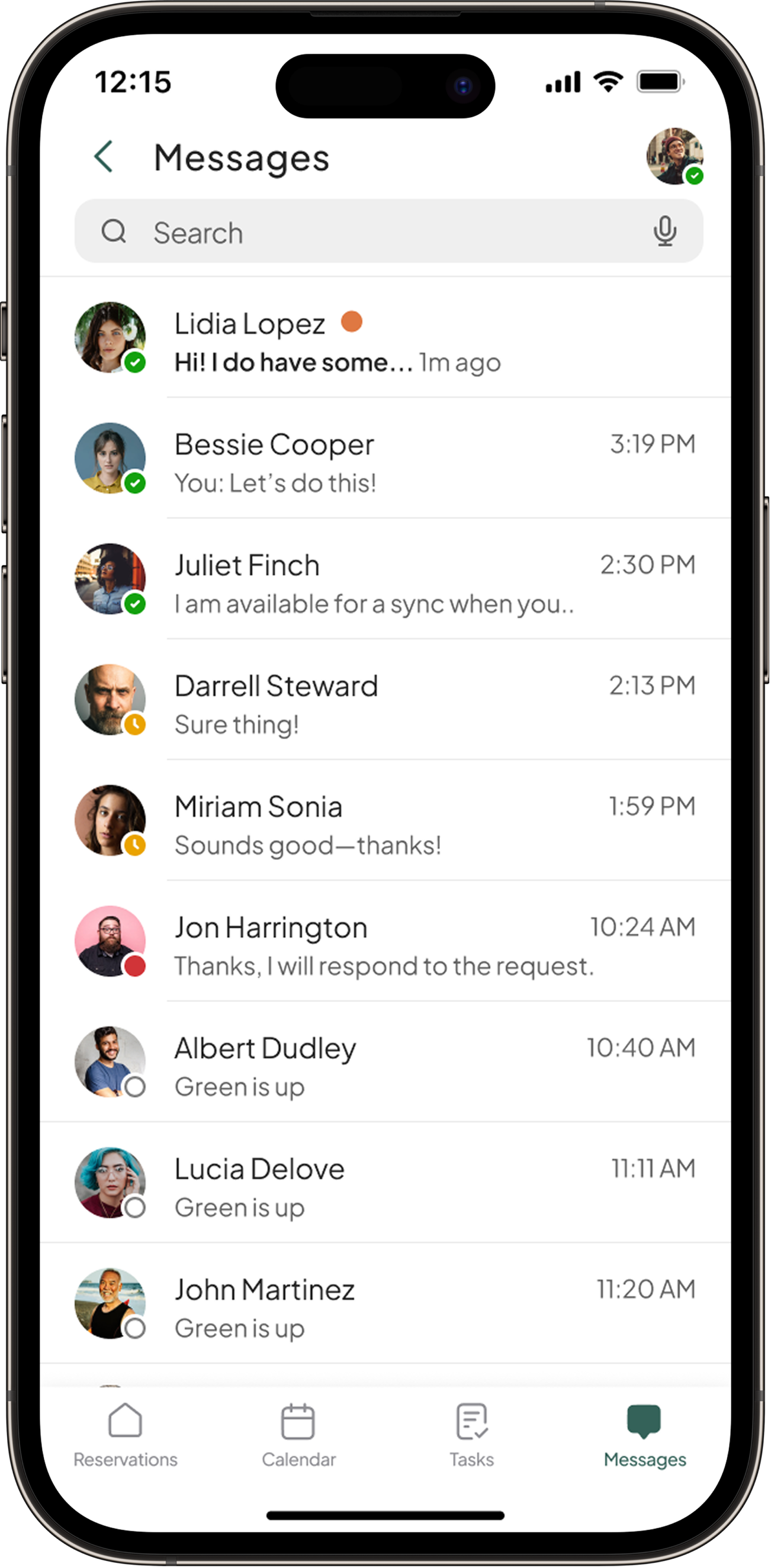
Messages & Inquiries
Unified inbox separating active messages from pending inquiries. Accept/decline action available inline without navigating to reservation.
Tasks
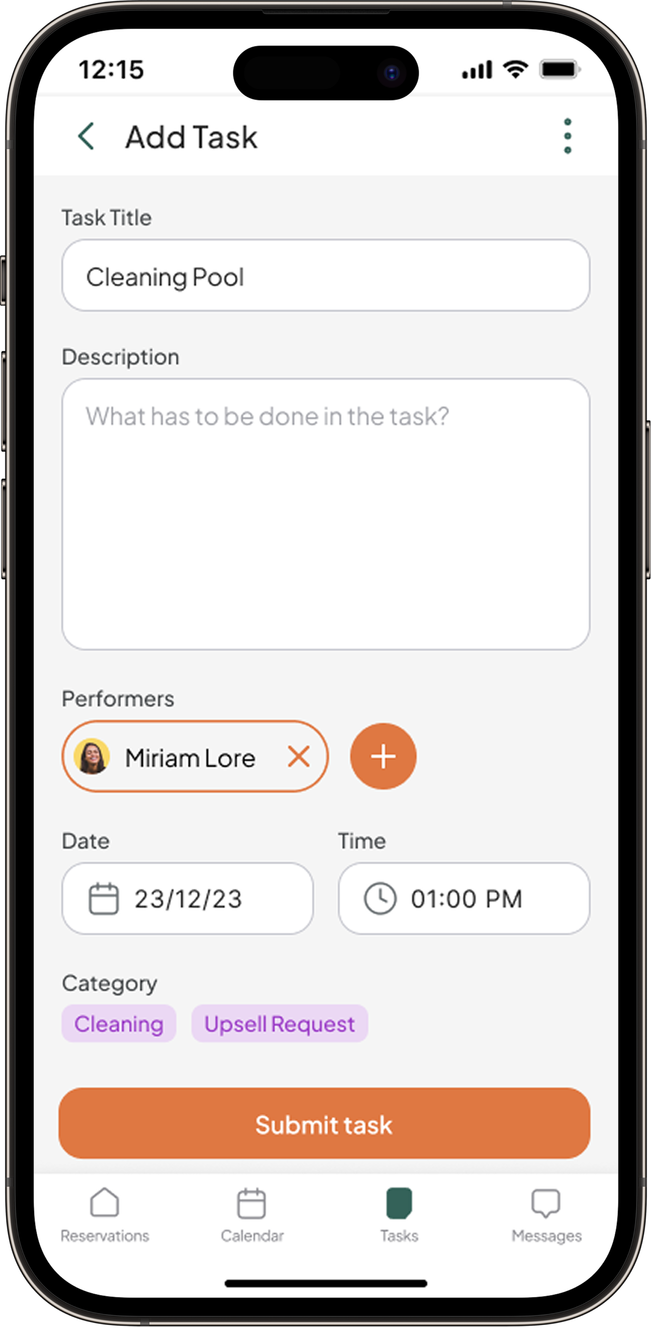
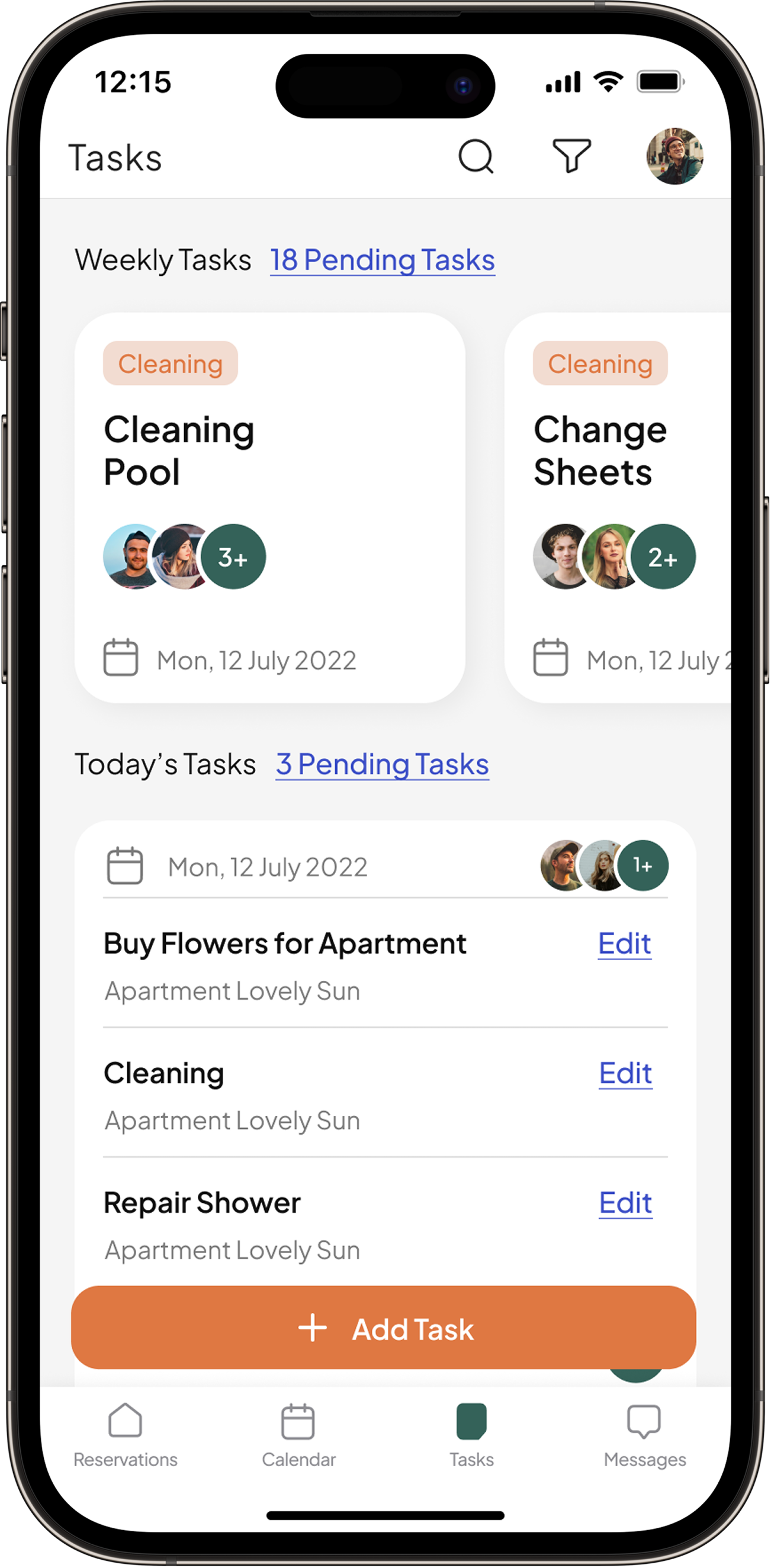
Weekly and daily task views separated. Task creation linked to reservation context — assign performer, category, date, and time in one sheet.
USER FLOWS & UI
Five flows mapped from research findings to final UI. Each flow was tested at low fidelity before moving to high-fidelity screens, with task success rates measured across both rounds.
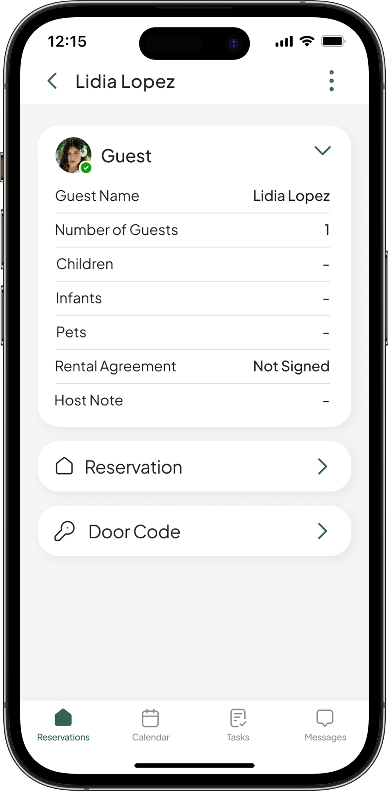
1
Guest profile
Tapping the guest name on the reservation card opens the full profile — guest count, children, infants, pets, rental agreement status, host notes, and door code — replacing what was previously a multi-step lookup.
2
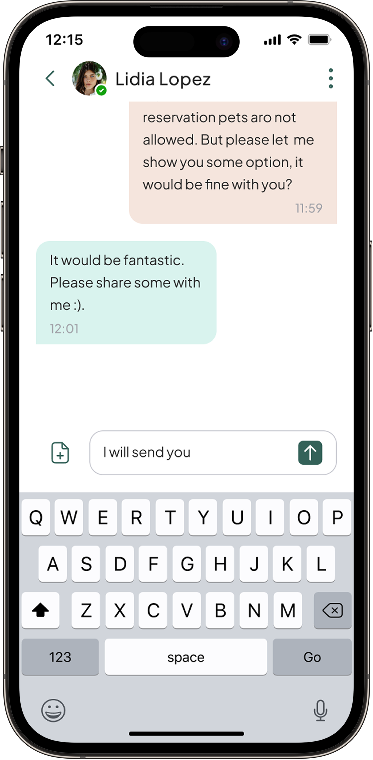
Contacting a guest
"Contact Guest" on the card opens the message thread directly, pre-loaded with booking context. Composing and sending uses the same in-app keyboard flow as any native messaging app — no learning curve.
3
Creating a task
From an empty state or the weekly/daily task list, "Add Task" opens a single sheet to set title, description, performer, date, time, and category — assigning staff work without leaving the task screen.
REFLECTION
What worked
Mixing quantitative and qualitative research from the start gave the design a concrete foundation — the 38% finding on guest profile wasn't a guess, it was a measured failure rate that directly shaped the card redesign. Running usability tests at low fidelity before building high-fidelity screens caught flow issues early and saved significant rework. The two-round testing approach also built confidence in the final design: the 8/10 score came with no desire to switch products.
What I'd evolve
The persona model was anchored heavily to the primary manager archetype. A follow-up phase would explore staff and owner journeys more deeply — particularly around notification design, which surfaced repeatedly in interviews as a pain point but wasn't within the scope of this sprint. Calendar and financial reporting flows were also deferred — both are high-frequency tasks that deserved the same treatment applied to reservations.


